Analysis of Band Magazine Adverts
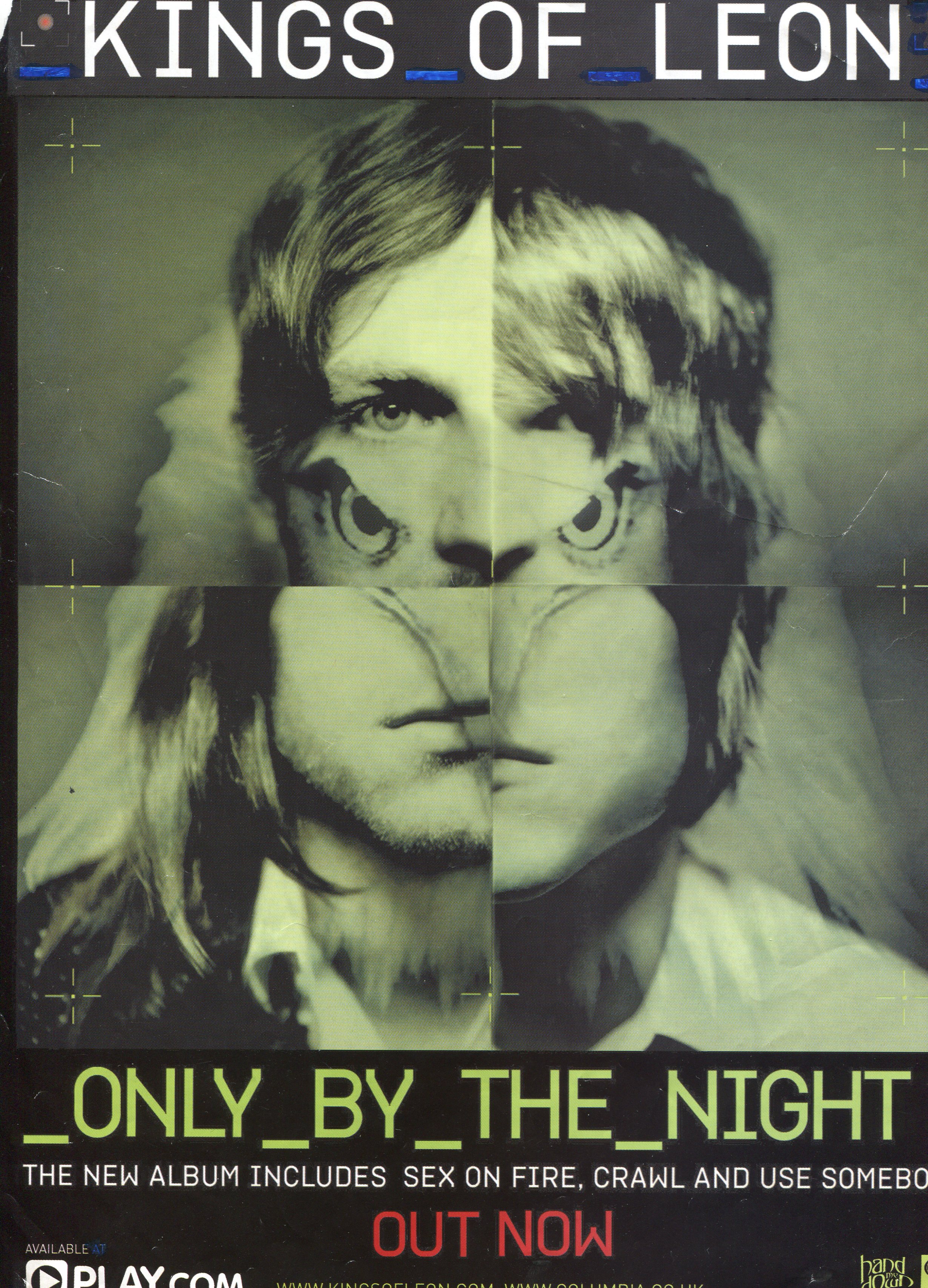
- The adverts colour is consistent with album that the band is selling
- The artwork is similar if not identical the the album's artwork
- Includes the name of the band at the top in the large bold text
- The name of the album is in bold text at the bottom, accompanying it is a line of text telling the viewer about the songs that are featured on the album.
- The text 'out now' is in a different colour to the rest of the advert, this is make it stand out for the rest of the piece as this information is key in selling the album.
- At the bottom of the advert it includes the names of places that the album is for sale

- The text 'The Smiths' in the line 'the sound of the The Smiths' is in a different font, colour and size to the rest of the line. This makes the band name the most focused on feature in the magazine advert.
- In the center there is a large image of the band, which advertises the image of the band as well as the album
- 'The sound of The Smiths' is repeated below the main image, this time it is all in the same text and is much smaller. This is because this is more like information about the advert rather than a way to catch the readers eye
- Includes information on the different formats and versions that the album can be bought in.
- Includes information about the songs featured on the album.
- Uses persuasive language such as 'All the hit singles' and 'contains rare B-sides'
- Includes information about what extra material is available on the deluxe edition
- Includes the date of release in bold all capital text
- Features a website at the bottom as well as the record label associated with the band

No comments:
Post a Comment